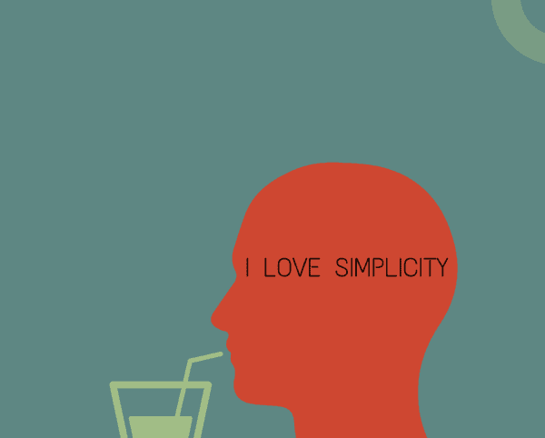
Design isn’t just about visual presentation and aesthetics. Although that’s important, a design is primarily about communication which is often best when it is concise. Put simply, sometimes Less is more.
This is something that many designers struggle with. In most of the cases it’s not always their fault. Often they will get a competing opinion from someone who is not a designer, whether that be a client, a supervisor, an employer or someone who doesn’t necessarily understand the importance and value of minimalism and its effect on both presentation and communication.
You might be paying for the entire space for an ad on a page, but using as little of it as possible to get your point across is sometimes the best way to create emphasis and impact.
Technology and consumer electronic companies accomplish this in their advertising. If you look at any of the recent ads for Apple and Samsung and even Google, in any media whether that be print, online or even videos, you can see their emphasis on minimalism and the real idea that less is more. They make their product the hero by making messages impactful.
The product that they are talking about is usually featured on a clear background. With black or white and a subtle gradient or drop shadows, they let the product take the center stage. They don’t utilize colour and don’t have a lot of flying motion graphics going around. They keep it crisp, minimalistic and make you focus entirely on the product.
And thats been very successful as we know that it works, but more importantly you have to remember that these companies not only spend millions of dollars in their advertising but also in their research with regard to what works, what plays well with audiences and their focus groups etc.
So the odds are these are the smartest and most competent people in the creative service industry and when they are doing these things, they are doing them for a reason.
So imitation in this regard is not necessarily stealing, its not being lazy; it’s using an intelligent shortcut to make the best decision possible. You want to have a clear and concise intent and action that the user can commit to. This is also true for User Interface Design as well Product Design.
Look at our smartphones which follow the concept of KISS : Keep it simple, stupid! That’s something that a lot of people forget whether be it in graphic design, or product design, web design, UI development. A lot of times, people make things overly complicated and cluttered.
I recommend that when you need to explain why you are using minimalism, why you are not necessarily using all of the page or why there is so little text, it’s not that you are being lazy and unimaginative. Instead, you are trying to be impactful, bold, concise, and making the product a hero and trying to let the message speak for itself.
These are phrases that are going to help you when you need to convince someone of your use of minimalism. For folks who don’t have an arts or design background, minimalism does come off as being lazy or not being thoughtful and doing as little as possible.


